graphic design interviews
type handling
This project sparked my intrest for organizing type. Our class researched an interview with a graphic designer and got the transcript. From there, we were tasked with designing a layout to present the content effectively.
This process began with creating a consistent grid for each page, ensuring the parent pages were used efficiently to support the design. I developed paragraph styles to maintain consistency throughout the project and explored InDesigns features more deeply to enhance the overall workflow.
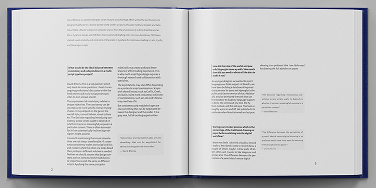
Print 8x7.5 in
2025